Stanford Shopping Center
Art Direction, UX, Design, Development
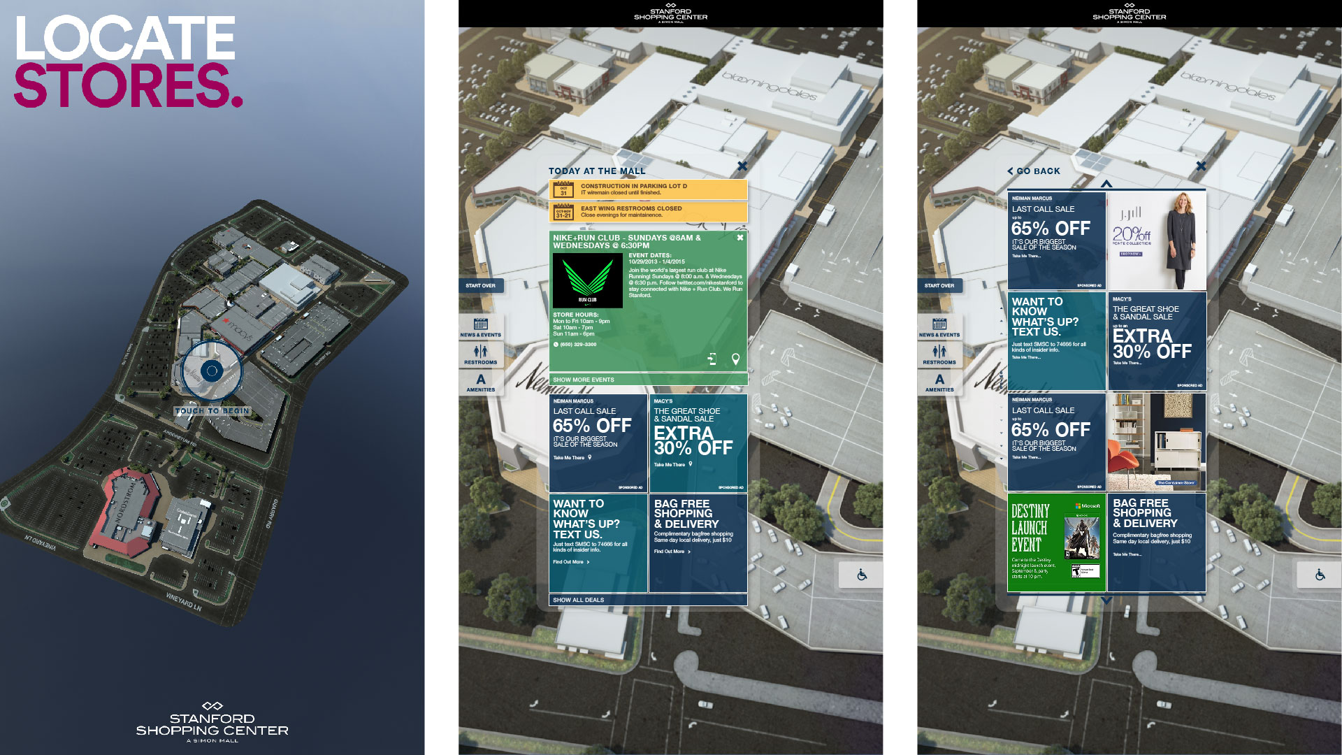
The "Connected Mall," is an interactive, 3D wayfinding experience to help visitors to the mall orient themselves and find stores, view local events, and get deals.
The Goal
First Person partnered with the eBay Retail Innovation team, now Oak Labs, to help develop, from concept through installation, a stunning wayfinding experience for Simon Property Group and the Stanford Shopping Center in Palo Alto, CA. We had three key objectives.
First, we needed to replace traditional flat maps with a kiosk that not only made finding a store faster and easier, but the whole process needed to take less than 30 seconds. Second, we needed to able to engage a large number of shoppers and provide traffic shaping: how many used the kiosk, what did the search for, what offers and deals did they select. Third, we wanted to drive the shopper to a mobile experience by pushing their maps and deals to their phone.
The Result
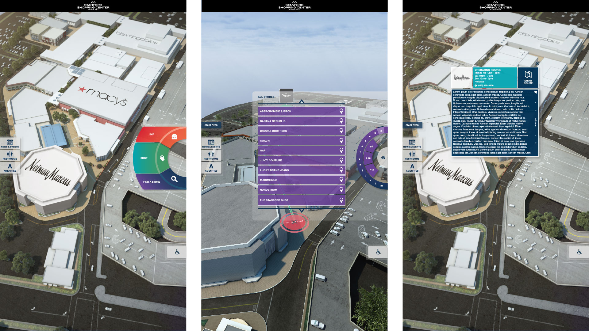
Built with WebGL and HTML, and running on Google Chrome, the directory displays real time 3D generated maps of the shopping center. Routes can be explored with crystal clear and fluid 3D animation that orients the visitor to their location in the mall. The kiosk utilizes various web platforms like AWS, Localytics and Twilio, so that maps can be sent to users phones and all of the interactions are tracked. The kiosk also features events, services and store deals and advertising to promote the mall and its stores.
The eight kiosks proved so attractive that 3 out of 4 visitors to the mall interacted with them, generating over 60,000 interactions in the first December alone. The connected mall experience was featured in several press releases.
“What we have seen is that, when one person is using the kiosk, it attracts people who gather behind them to watch because they’re intrigued”
UX Research
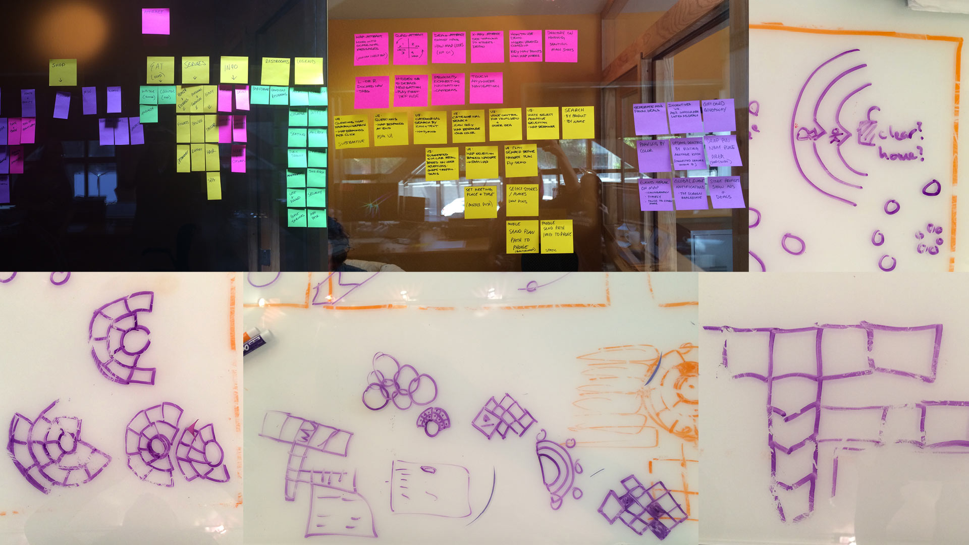
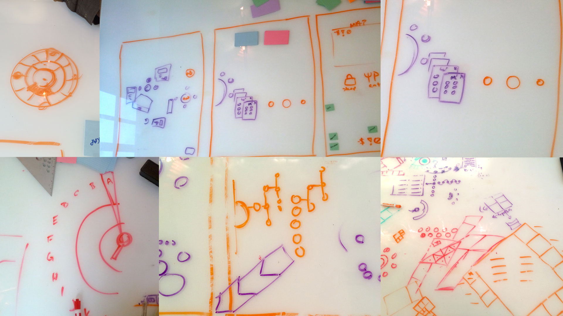
Extensive research was undertaken in creating the kiosk. We conducted competitive analysis on any examples of digital way find we could find around the world. Most were clunky and unattractive. Many were simply recreations of a 2D map, that shifted, or showed layers, but were not true 3D. We also took field trips to a local mall that we knew had recently installed digital directories (finding that their experience was extremely lacking, if not confusing). Beyond that, we were given access to visitor data at the shopping center.
We knew we needed to make the kiosk extremely easy to use since were were taking away a standard method of navigation buildings that, most
people were at least used to seeing: the overhead, color coded 2D map.
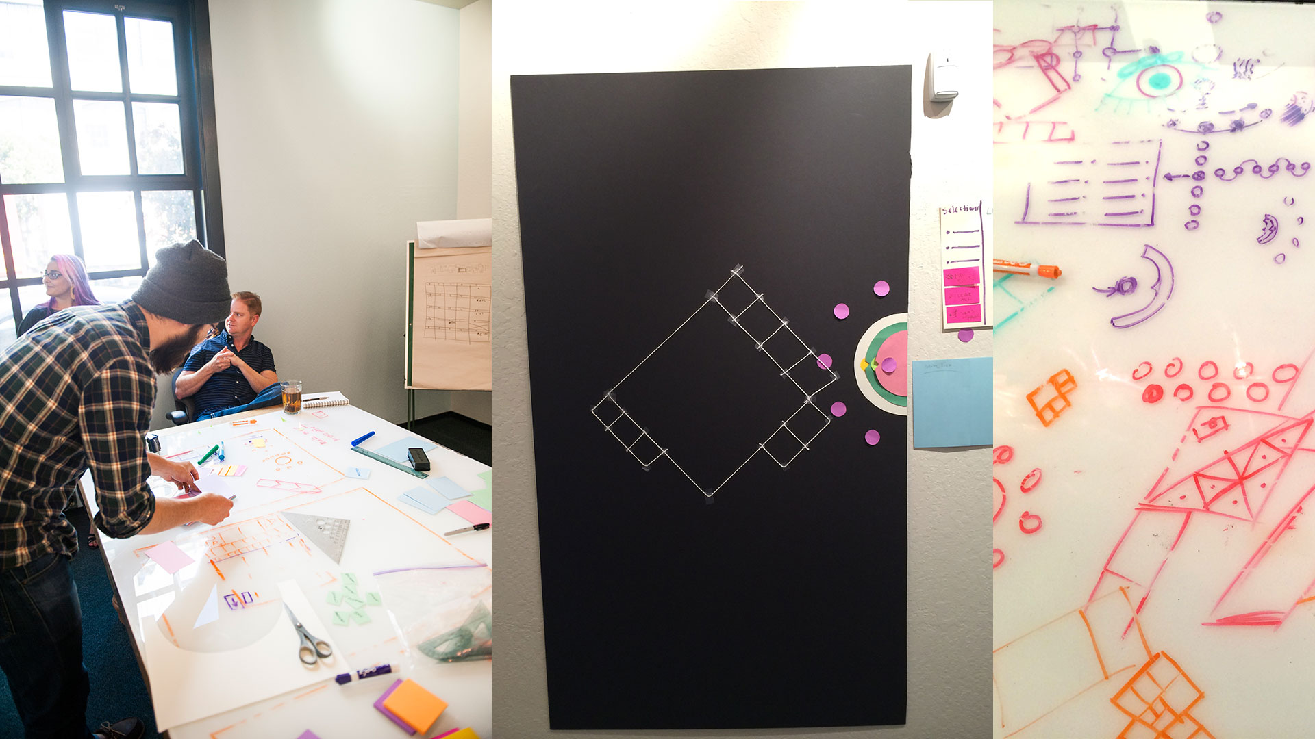
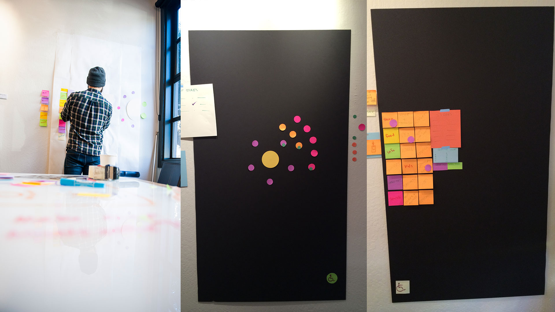
After conducting research, I crafted user journeys around our proposed concepts. I then did an assessment of multiple Simon Mall properties to craft an architecture for the directory categories that included hundreds of store, while keeping in mind store types that didn’t exist at Stanford Shopping mall for the possibility that the experience could expand to multiple properties. I tested my category organization with coworkers unfamiliar with the project to see if they could find a specific store within my the architecture.
Concept Research
Concept Research
User Journey
User Journey
Kiosk Category Architecture
Prototyping
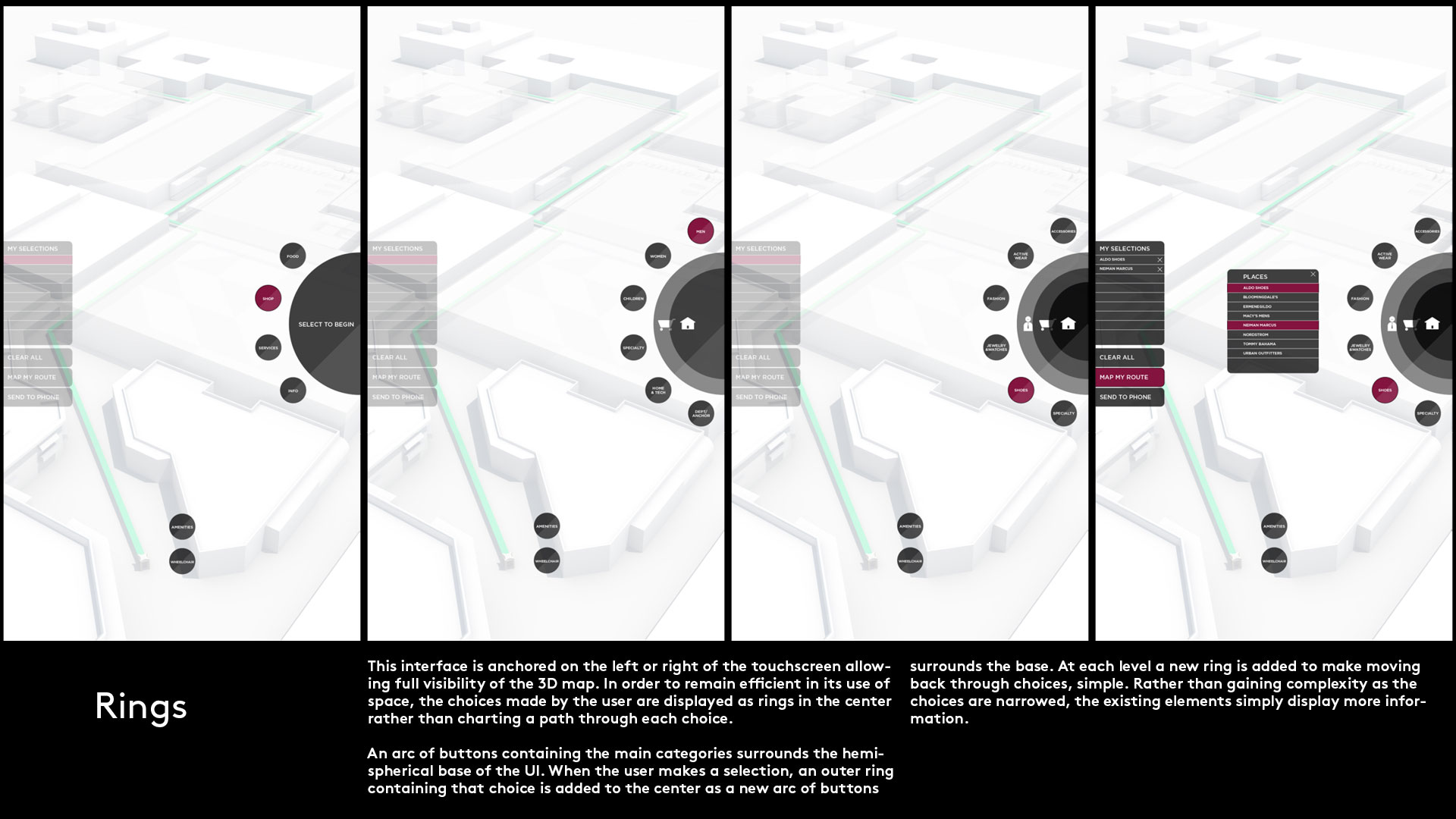
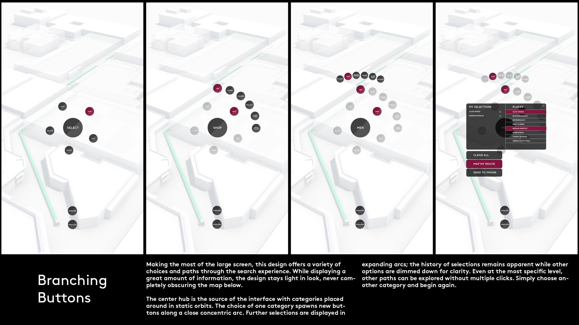
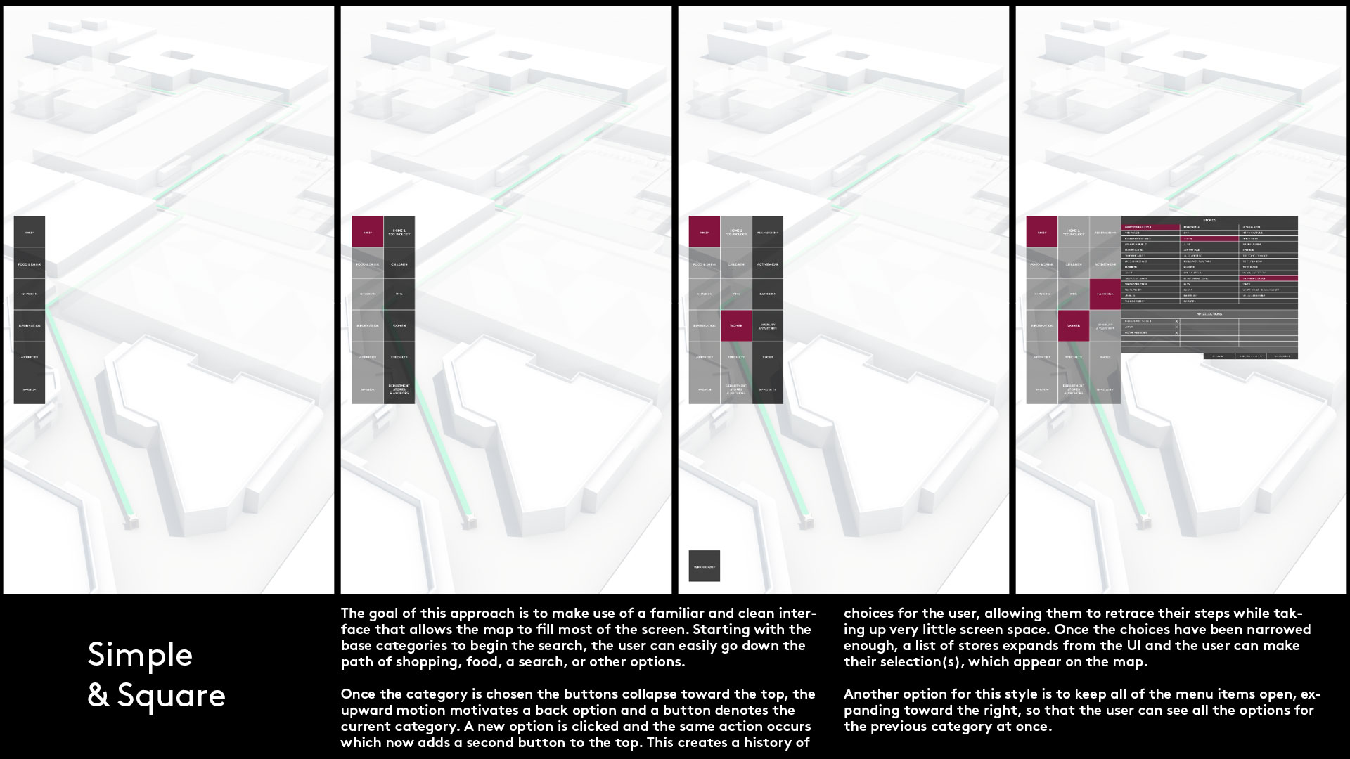
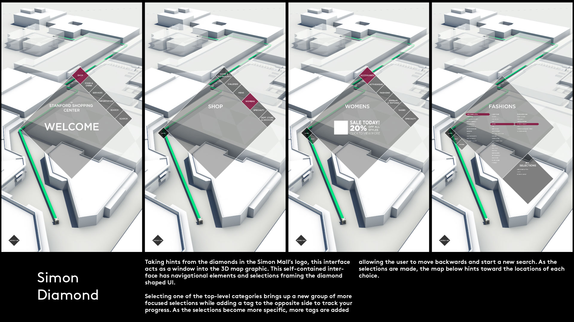
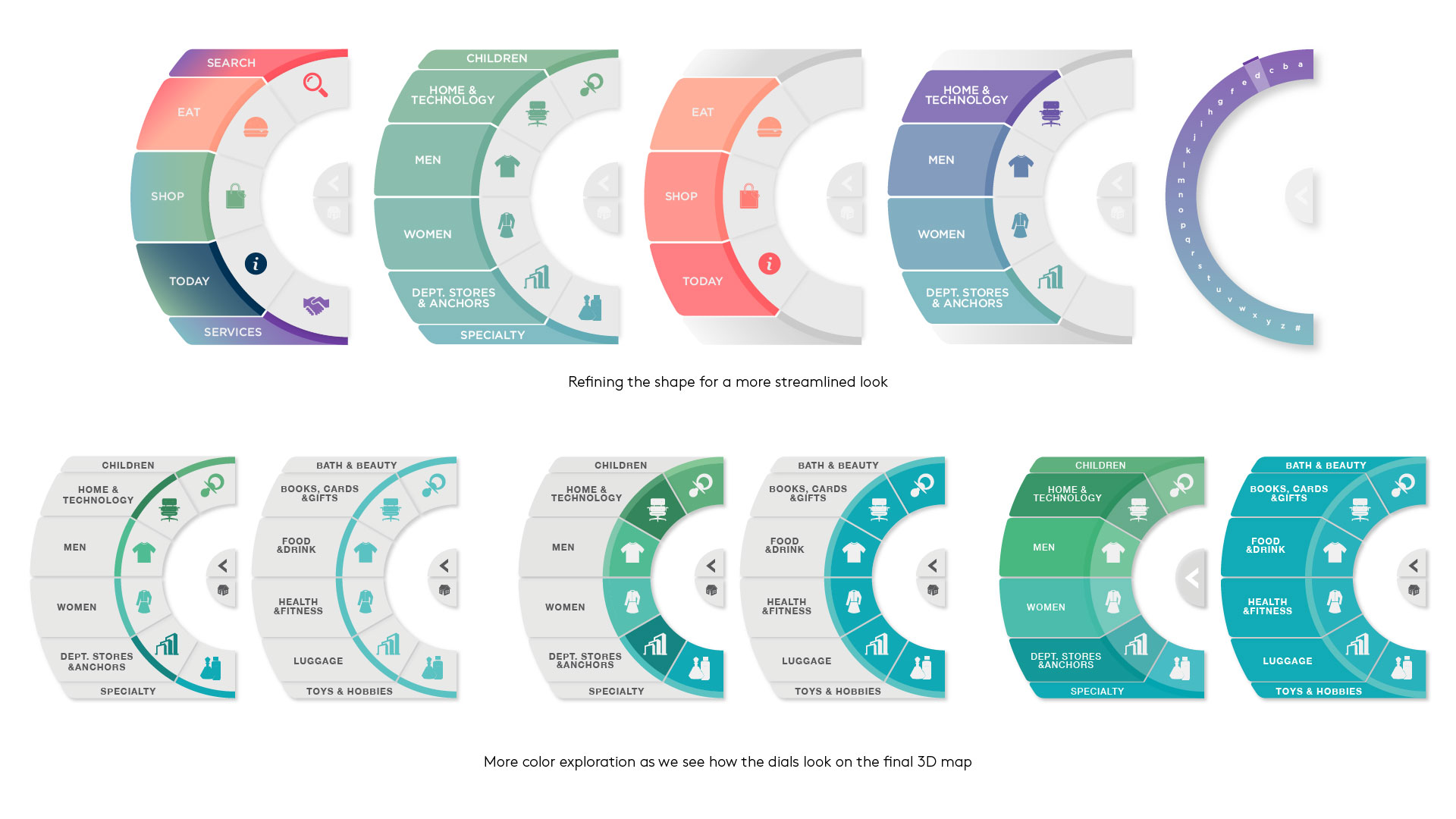
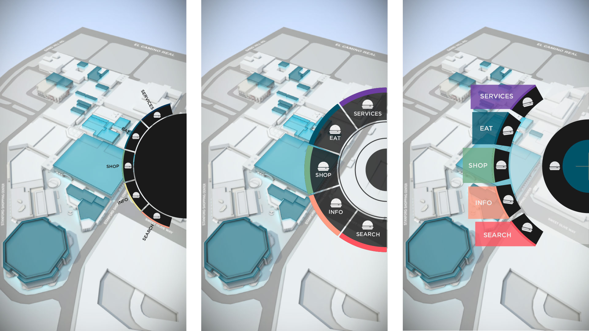
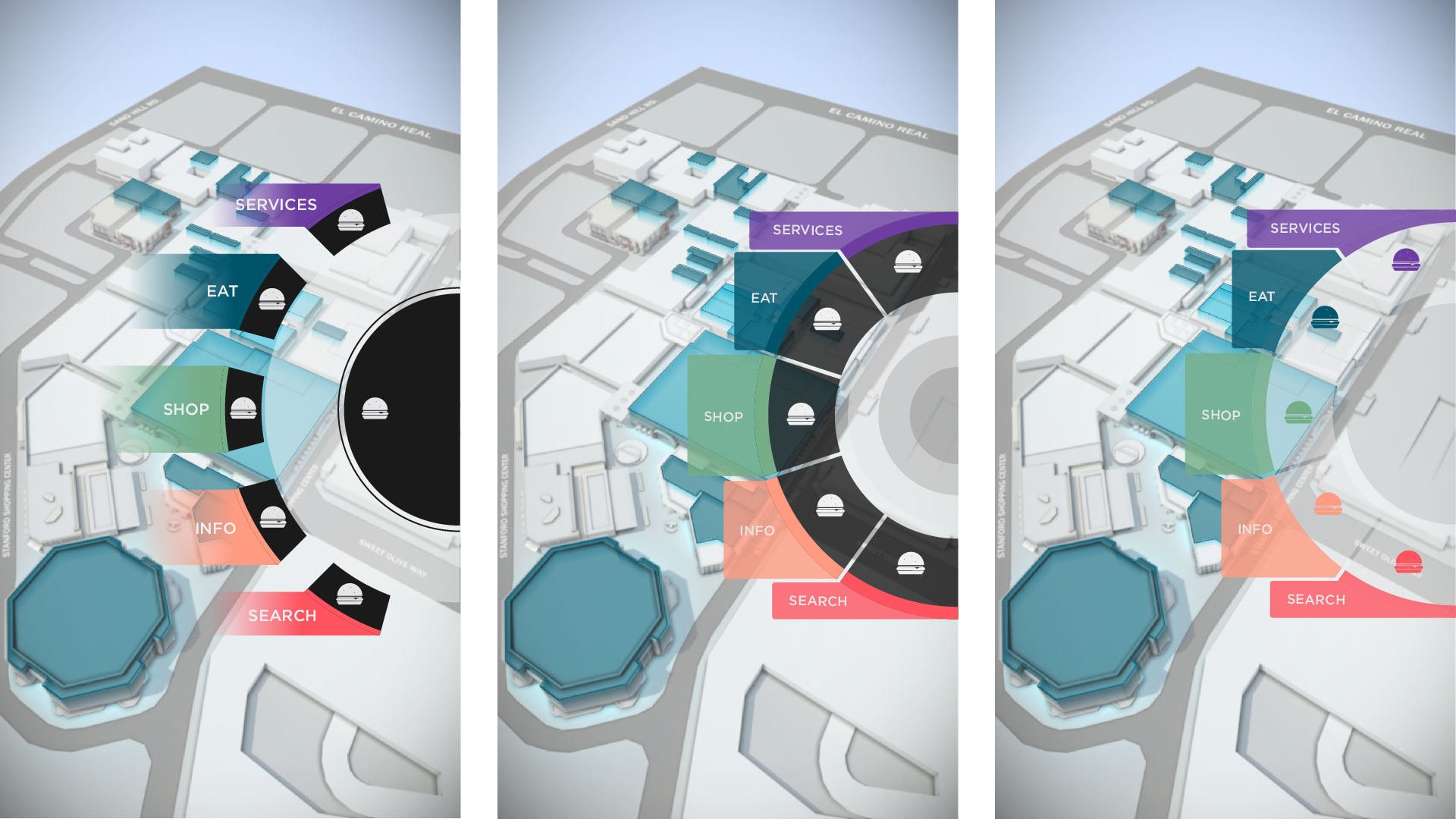
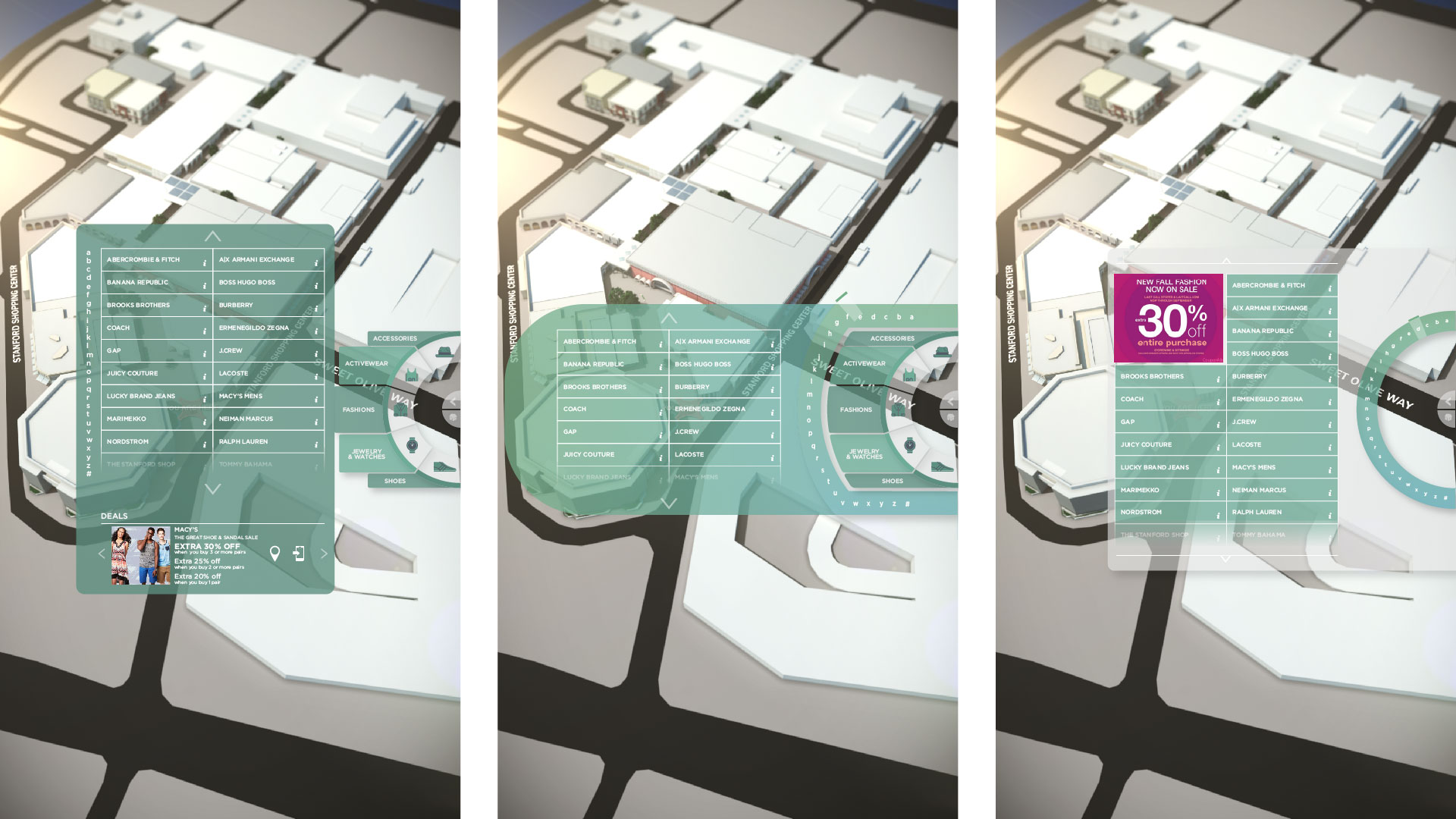
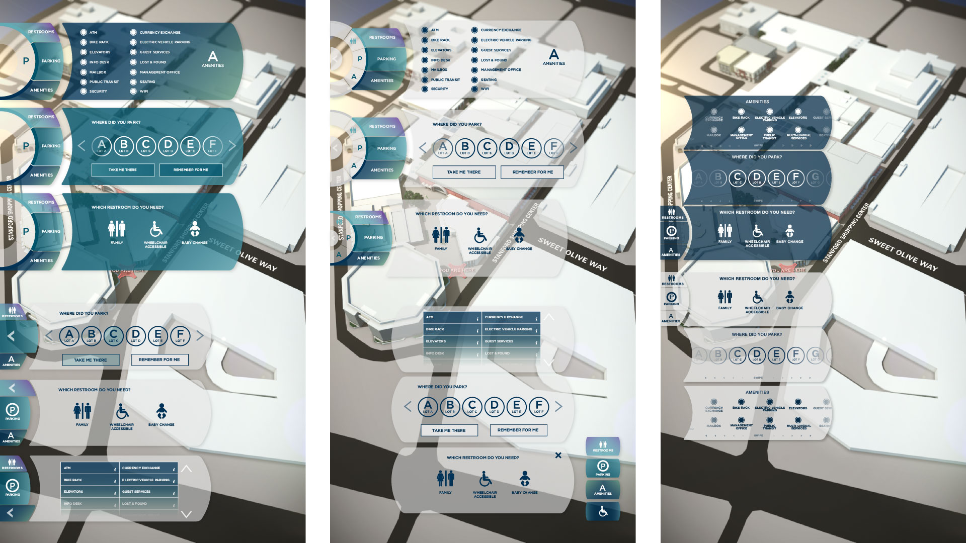
During the prototyping process we conceptualized several different ways to display the information to navigate the categories. We wanted to push beyond a website-like navigation and typical shapes, while still being easy to
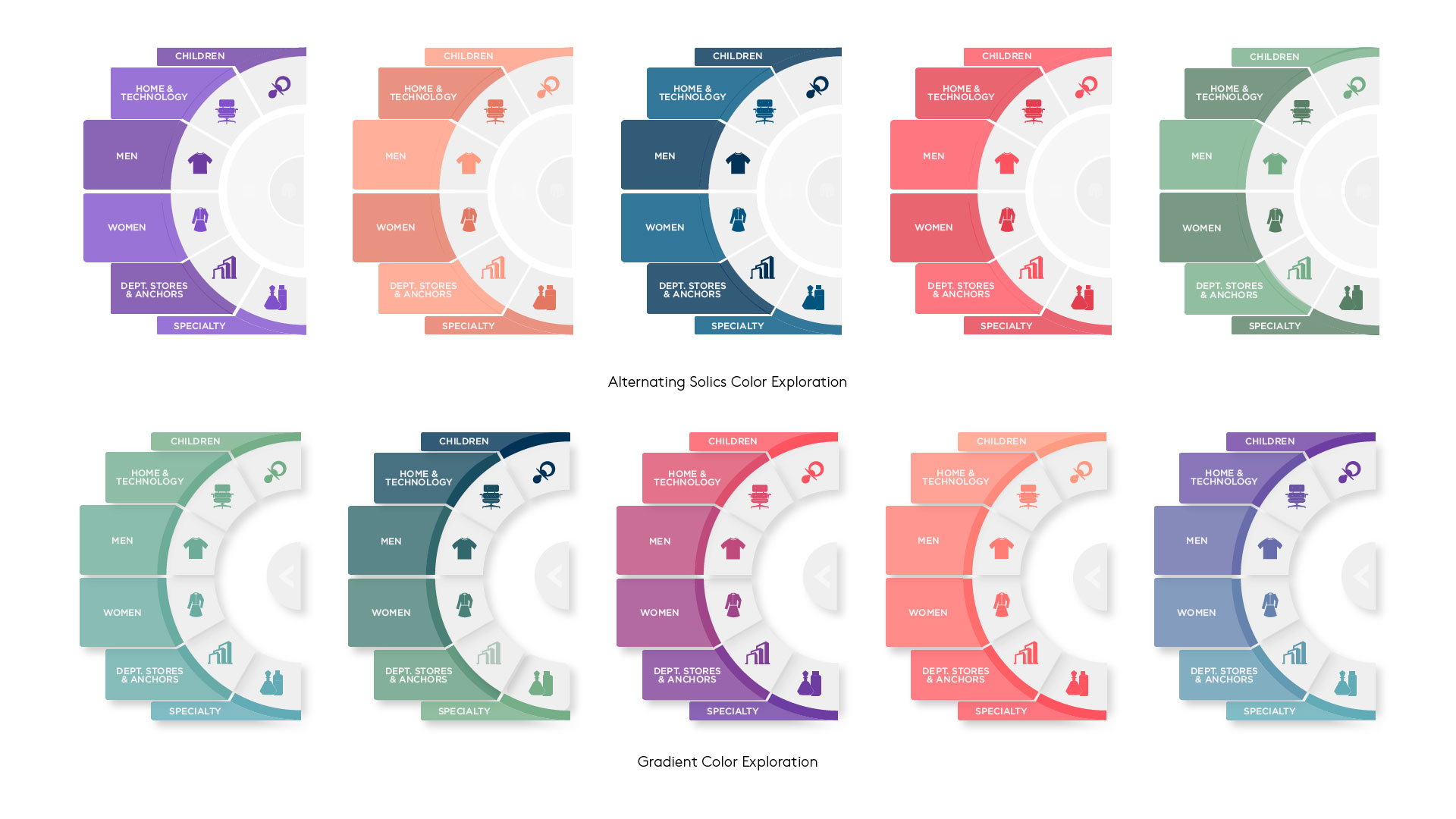
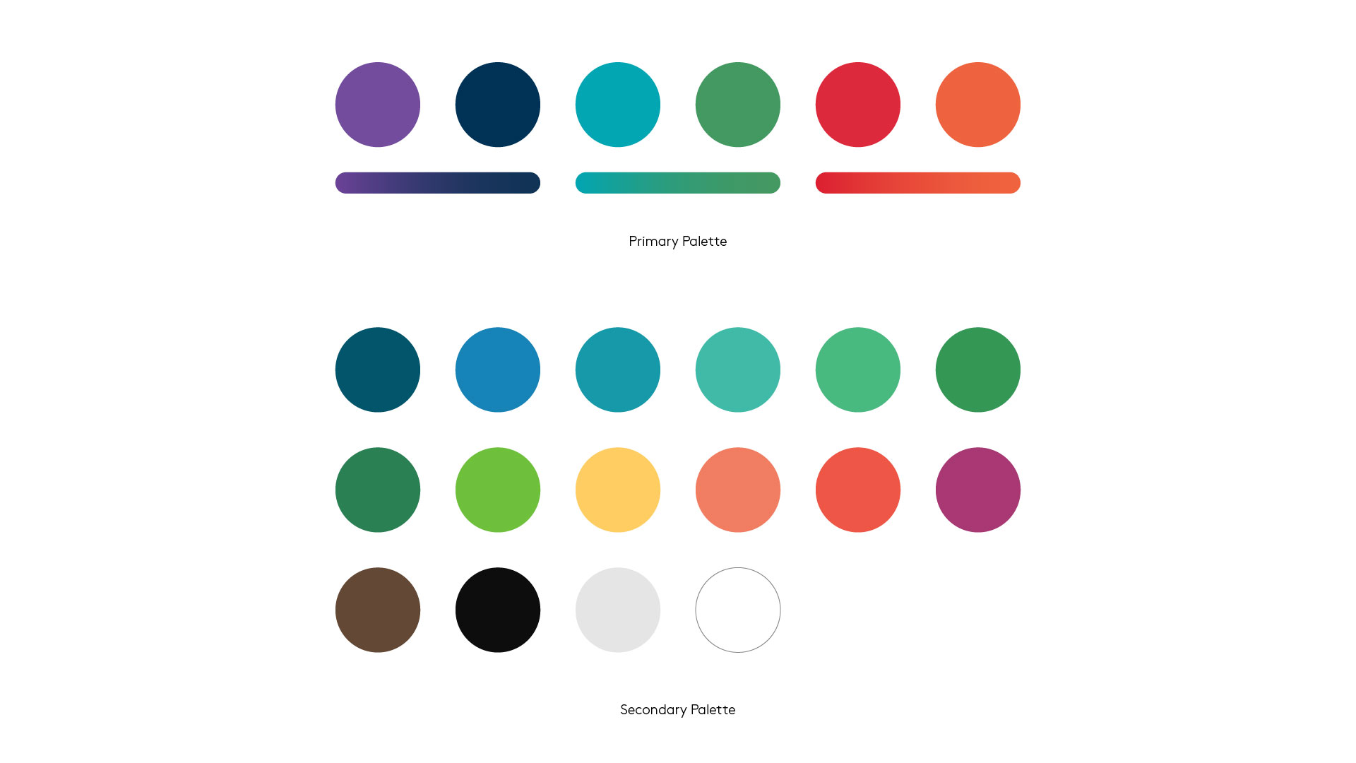
use. We realized early that our navigation should not interfere with the 3D map that orients and guides the visitor as much as possible. Our color palette was purposefully bright and friendly, and visible from afar.
UI PROTOTYPE ANIMATION
Creating a video prototype let us improve the design and finalize the UI before we started coding. We made a simple touch-to-play video interface displayed on our actual touch screen hardware to test the full experience. We made sure the timing and transitions for every moment felt natural. It was used to approve design, as well as inform developers on how the kiosk should function.
3D FLY-THROUGH ANIMATIONS
We did extensive testing for the UX of the 3D design leading a user to their destination. We questioned our initial assumptions about what would be successful translating wayfinding from traditional flat, top-down posters, to a dimensional experience. Over a dozen animations were created to test the navigation path and how intuitive it was to understand without causing motion sickness.
Design
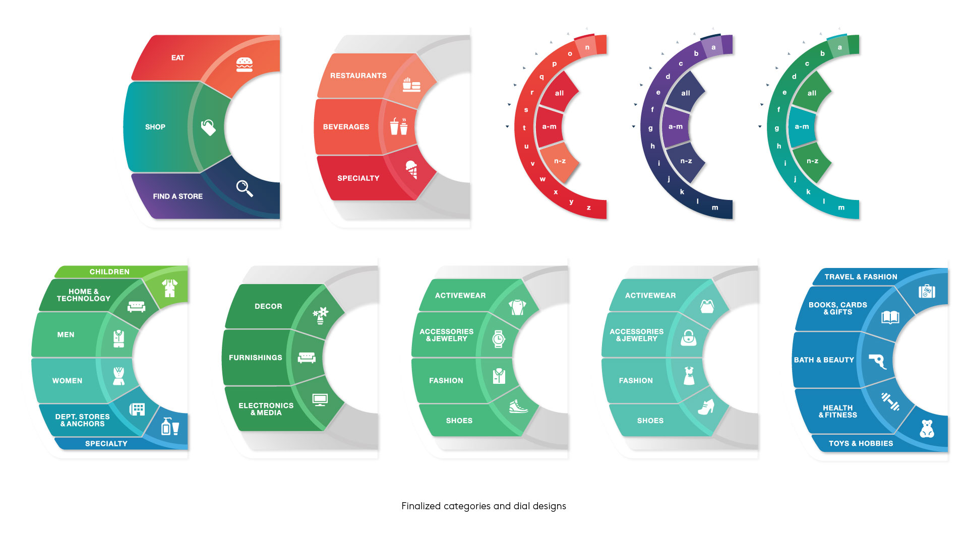
Each button we designed had to be big enough to touch without error, especially with a parallax effect between the display and the weatherproof glass. Our colors were carefully chosen to be inviting but stand out against a colorful 3D background. Since the shopping center has many foreign visitors, we had to use universal iconography to make sure all categories were clear despite the language being in English. We design around text sizes with the intent to allow for localization in future iterations of the kiosk. We also knew that the map would need to be accessible to wheelchairs, or ready to have voice-over accessibility in the future. All the of technology chosen to put into the enclosed machine was ready for future updates to improve the experience beyond the MVP.
There were many features that we wanted to include from our concept phase that couldn’t be integrated into the MVP map. Some was due to the technology availability, or coordination with physical contractors, and some was due to the discoveries in our research, understanding the types of interactions we could and could not expect the majority of our visitors to participate in. For example, the idea of creating a specific app to download in order to use less supported technologies at the time like beacons, RFID, or unique user logins. We also came up with a few mini games for children that could be played on the lower half of the screen without interrupting navigation, but couldn’t fit them in the scope of the initial launch.
Development
Originally we had planned to run the Kiosk in Unity with an HTML overlay, but early on we ran into problems with HTML over 3D displaying properly. Finding out that we couldn’t use the method we chose, which was ultimately supposed to be time saving, was stressful, but we buckled down, switched gears, and dove into WebGL. I was responsible in large part for HTML
structure and CSS styling, as well as making sure all elements were accounted for and went to the correct places. I worked with the rest of my team who was in charge of Javascript animations, WebGL, and API calls to our content management system as well as our text messaging service.
Installing the machines on-site


