First Person Website 2.0
Art Direction, UX, UI
First Person is a creative agency with a broad range of disciplines including Graphic Design, Video and Motion Graphics, Digital Campaigns, Content Development, Branding, Strategy, Experience Design, and Development.

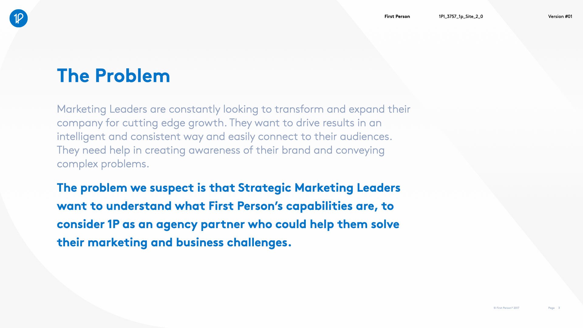
The Goal
Redesign the First Person website to better drive client conversion. The website needed to be concise, tell businesses exactly what capabilities First Person provided, and have clear and obvious call to actions to contact First Person for their project needs.
While the previous design showcased cutting edge web development and received an AWWWARDS honorable mention, it suffered in SEO placement, and focused on things that were important to First Person, instead of what was most important to our clients.
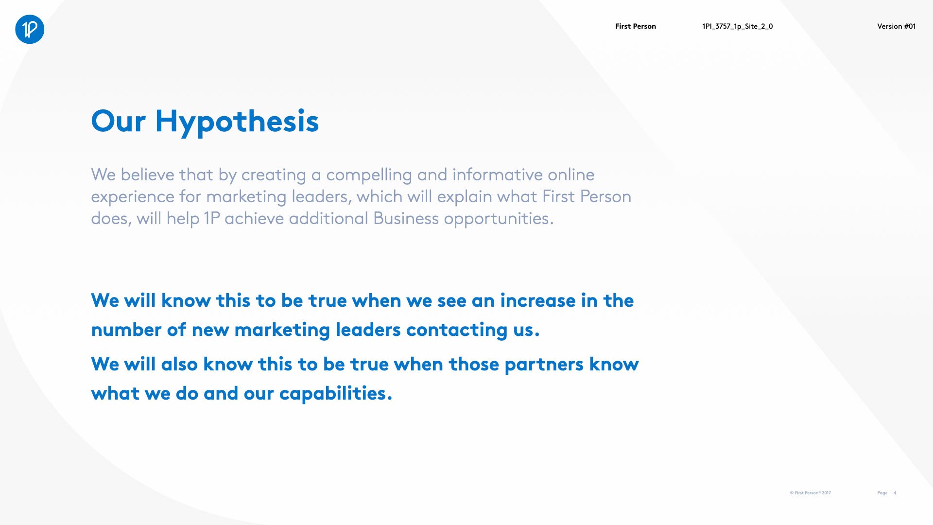
The Result
A responsive website with a home page that clearly communicated First Person’s capabilities and design philosophy. We updated our portfolio so that focused on case studies first. Each case study was designed to highlight tangible results achieved for our clients.
Improvement to SEO places First Person as a top page result for searching “First Person,” and the #1 result when searching “First Person design.” And now mobile users could view our work.
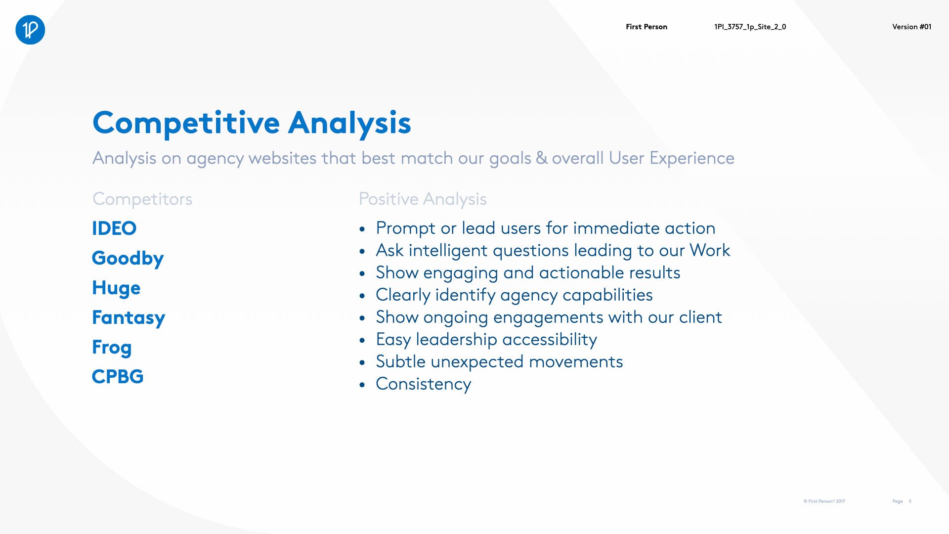
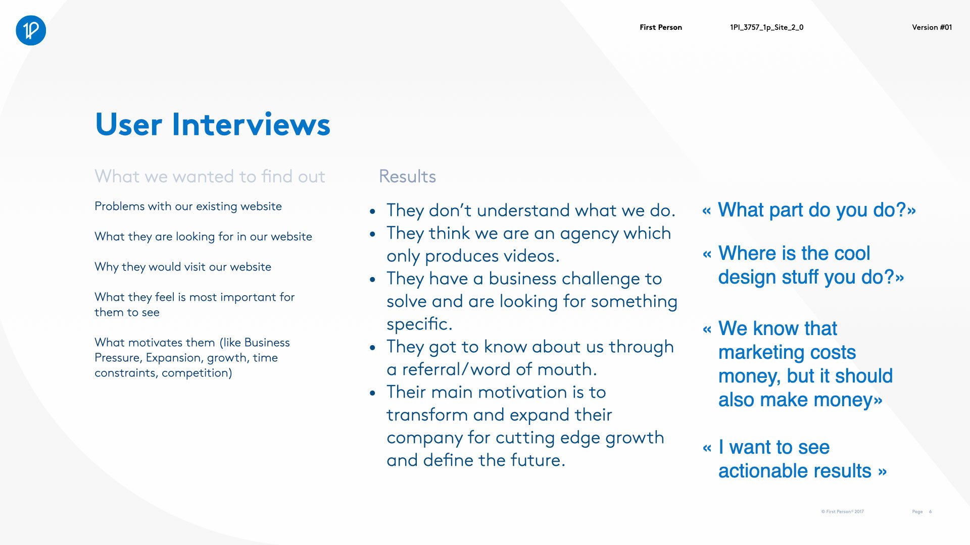
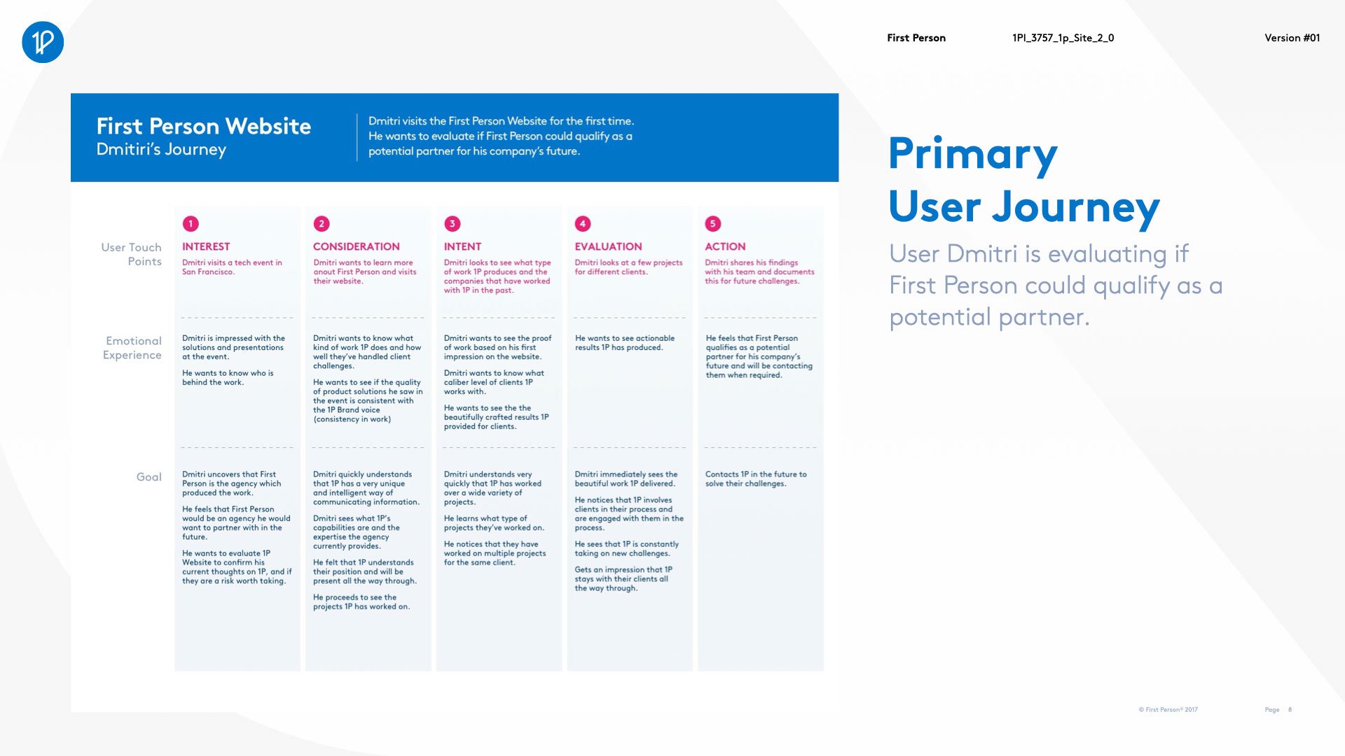
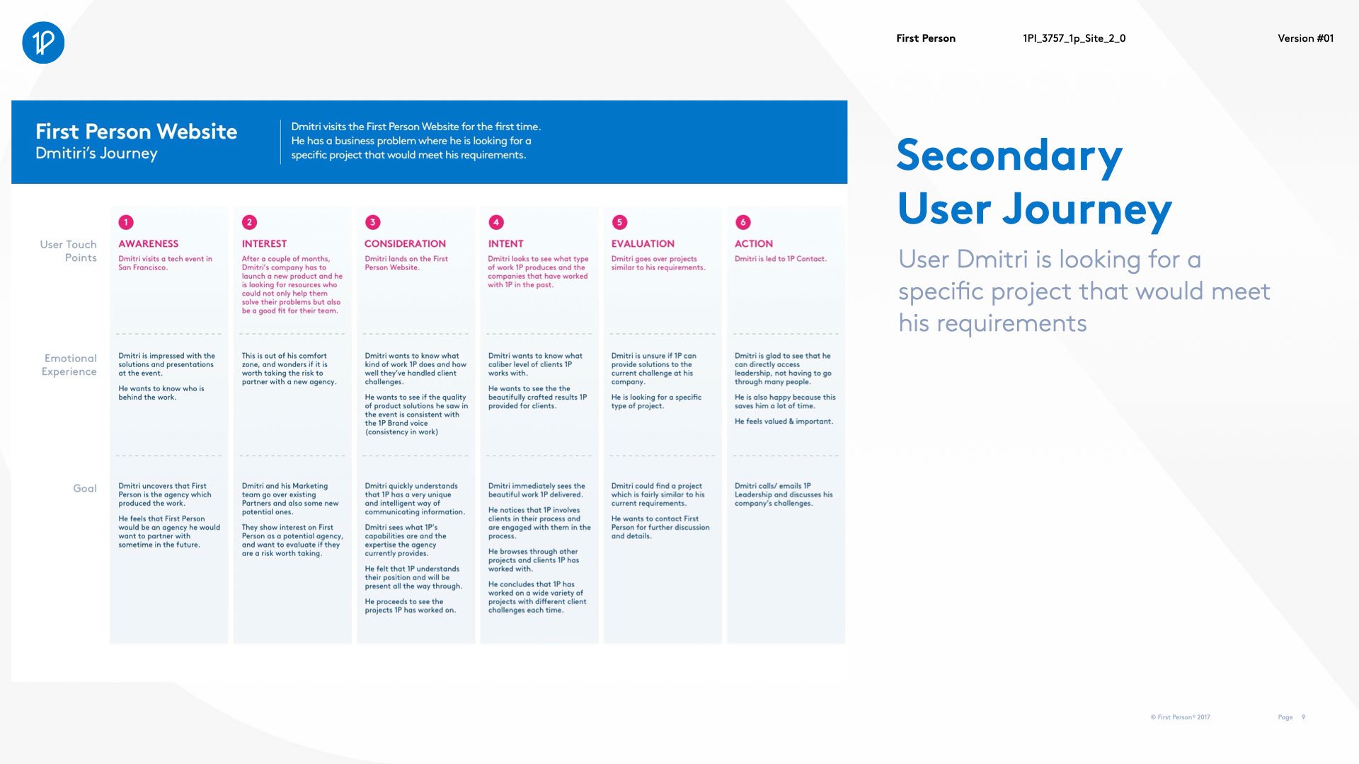
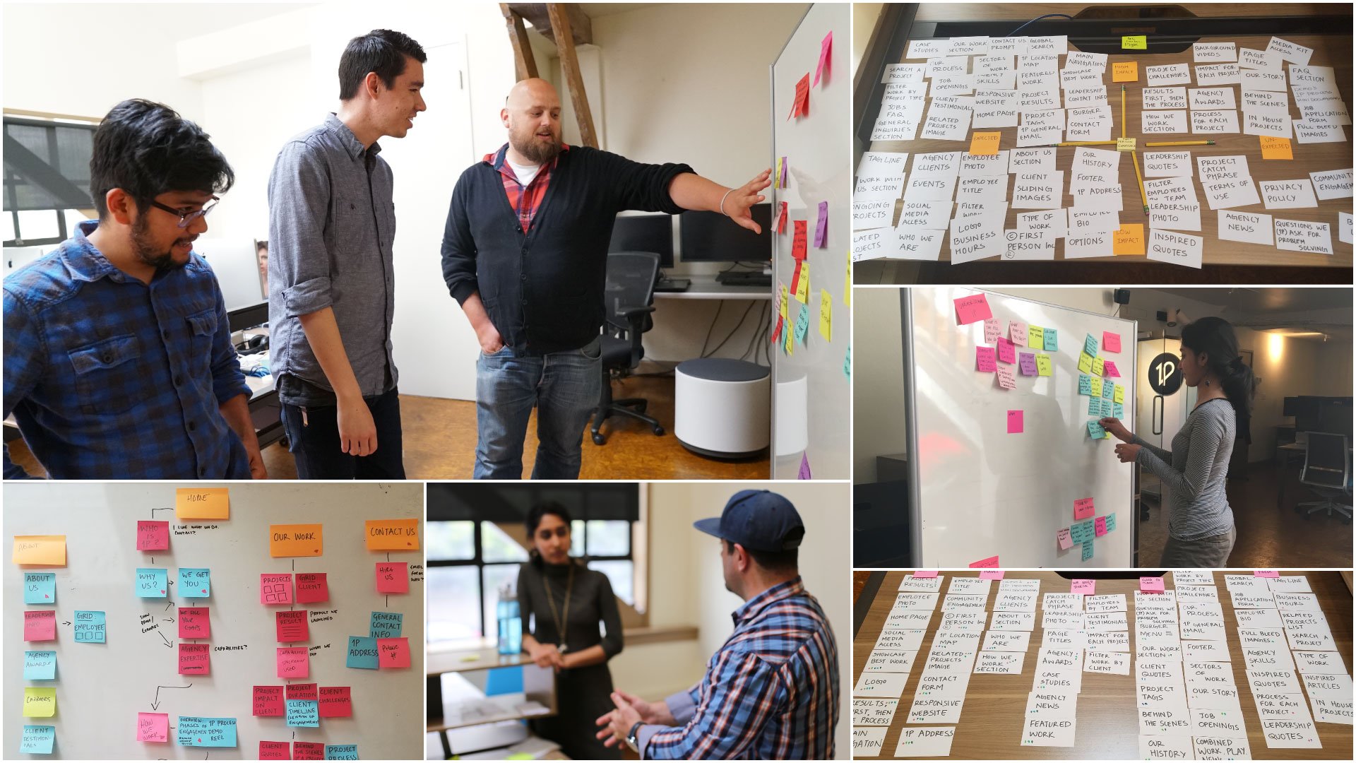
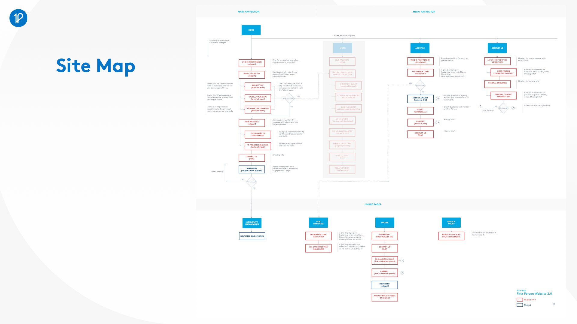
UX Research
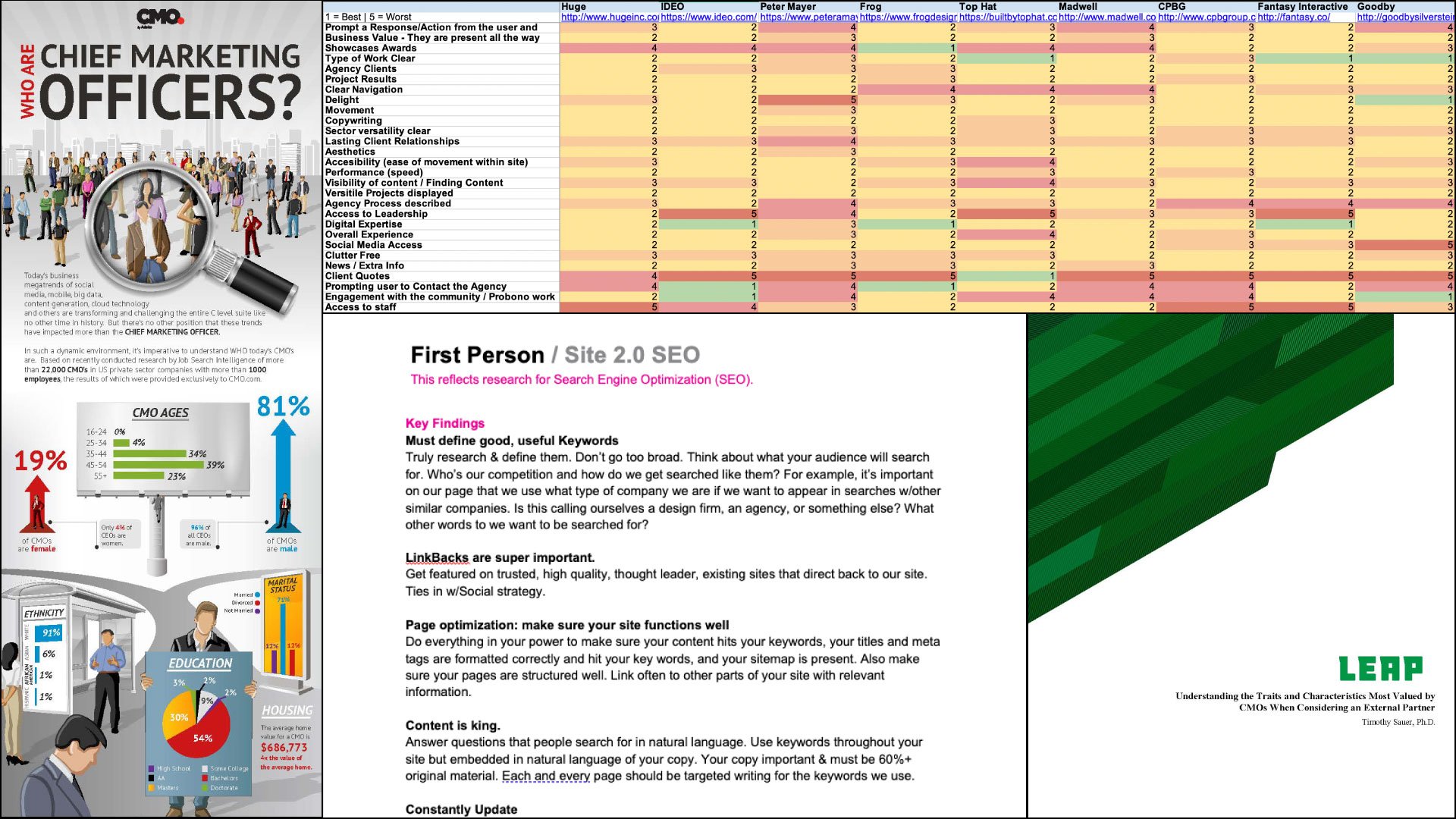
We researched competitors and peers to identify successful design strategy, and researched UX best practices, defined an SEO strategy, created site flows, and designed wireframes.
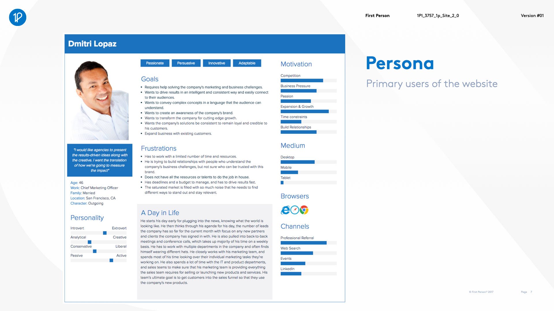
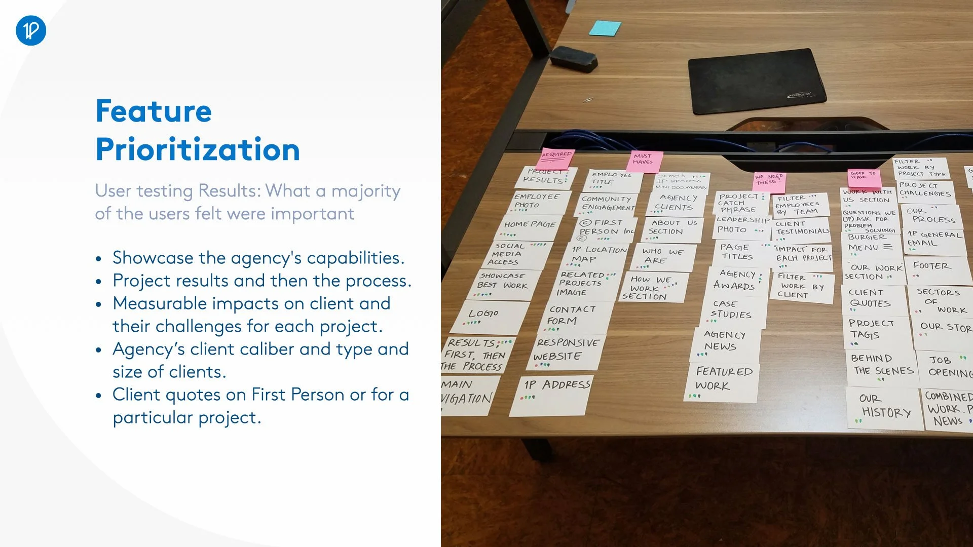
For the UX process we went through a gamut of techniques such as Affinity mapping & feature prioritization to identify the core needs of the website. We gathered statistic about our website traffic and what devices visitors use the most as well as our target audience by creating our target user persona.
“Focus on results more, clients do not care much about the process as much as the result.”